9.27.2011

Delta Gamma #2

We've got another commission for a Delta Gamma Mosaic crest! 
This time for the house at Tennessee Tech! 


In Progress


Finished photos to come soon...


See original Delta Gamma crest for Indiana HERE!


9.23.2011

Design Tips

Last week I was a guest speaker at Blue Valley West High School's Interior Design class!


I basically told them my own story (the idea of "story" seems to be so powerful to me lately.  Everyone has their own story and the depth behind story can mean so much; purpose, identity, brand...  Who doesn't love hearing a story?  In this case, not necessarily fictional- although that makes me think of the movie Big Fish, but our history and how our journey leads to our future)  My story included  the steps it took to get me to this point in my career (childhood, interests, classes, KSU interior architecture program, work, experience) and what I'm up to now.  Of course, it's an adventure and I'm excited to see how the "now" becomes my history and what my new "now" will  be in the future!


I thought of a few little Design Tips to give you all:


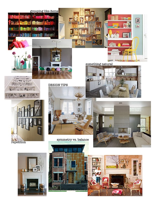
grouping like-items: to visually organize things, it helps to group them.  Examples shown are similar vases clustered, books arranged by color, collectibles organized by wall display boxes, and many different items on shelves to show how grouping items de-clutters a space for your eye.  This is the easiest way to display collections without them taking over and overwhelming a space.

adding something natural: just by adding an object such as a wood table, linen pillows, flowers, or by using natural materials like stone, brick, or reclaimed wood you help to ground a space.  A natural object helps to warm up a contemporary room, make guests feel comfortable in a formal space, or to add some organic visual interest to a clean-lined modern home.  It helps to blend the line between man-made and down-to-earth.

repetition: this is another trick to keep organization and consistency visually with items you want to display or accentuate.  Repetition creates visual harmony. The framed photos along a long wall but instead of hung in clusters and grouped they are hung along a central line which creates repetition.  A fun idea is to pick out a favorite wallpaper and use it to line the risers of an old staircase.  This creates surprise but also visual repetition and interest in an otherwise sometimes predictable area of the home.

symmetry vs. balance: sometimes a tricky one to understand, just because things might not be symmetrical does not mean they aren't balanced.  For instance, the mantle in the photo has a mirror centrally positioned above it and stools on either side on the floor = symmetry, but the branch, frames, vase and decorative objects are positioned asymmetrically creating a more interesting composition to look at yet the visual weight of the objects are still balanced on either side.  Main point: asymmetry is much more interesting to look at and experience.  Asymmetry excites the eye while keeping it balanced doesn't overwhelm the eye.  


Tell me if any of these tips helped you in your quest for solving your own design dilemmas.  I'd love to see pictures of projects you've conquered!  Feel free to chime into the conversation.

9.14.2011

New logo!

 So here's the new look I've created for my brand...

I was trying to figure out a logo for myself that speaks to who I am, my personality, and my story; something that represents the brand i want to create for my company.  If you're really observant, you may have noticed I changed my favicon [the little box next to my web address up top] recently.  I took the inspiration of that from some cut-out letters of my last name sitting on a shelf in my home.


They sit in front of a galvanized metal planter box with green moss and orange berries.  I took the typewriter font from the "K" and put it in front of a grey background with some orange berries in the right upper corner. I mean, what's Kara Kersten Design or The Kersten Haus without my last name Kersten?!?

Anyway, after reading some of my book The Handmade Marketplace by Kari Chapin, I got some inspiration for my logo.  There's a quote by Matt Stinchcomb, the Vice President of community development for etsy.com that said, "A brand is much more than a logo.  Your brand is your lifestyle & overall embodiment of what your business is about.  It is really important that you're telling your story.  Your story is your brand."  I tried to think of my story, describing words, what other's would say about me, how I see myself, etc...  I like change, spontaneity, color, vibrance, surprise, I like to adapt to different environments, solve people's dilemmas for THIER life with THIER style- not mine.  But how do I leave my own stamp on my work at the same time?  [So far, I think my stamp has been left through relationships and people.  I've left an impression of authenticity and community with the people who have touched my life and I'm happy with that.]  How do I come up with a recognizable symbol that is stabile, constant, and predictable when I am not always predictable?  How do I come up with something that can adapt, change, and morph while still being the same?  So I took inspiration from my little favicon, and realized the berries could be circles, the circles could be interesting fabrics and patterns, they could change color with seasons, projects, product lines, and still be recognizable.  It feels happy, crafty, simple, exciting, and fun, but most of all- like me.  I love that I don't feel restricted to a dead-set symbol with no flexibility, I can change up the colors, and pattern to mimic my many different moods and endeavors as I feel...  freedom!


Here is the New Business card design I came up with:

Front:

Back:

Tell me what you think of my new logo and business cards- I'd love to hear your feedback!

9.13.2011

Family Find

[Barbara Frets Simmons]

Look what I found at my grandma's recently of my Nana in the newspaper from 1985 (I was 1 year old)


Online, I also found her painting on the cover of American Artist Magazine, June 1985:


Barbara Frets Simmons 

Barbara Frets Simmons was voted “Class Artist” when she was a child and she always dreamed of going to art school.  But her father was more practical and insisted that she should get a degree in teaching…art.  After she married and began her family, she designed jewelry at home when her children were young.

By the 1990’s she was into her second career that of a well established painter, concentrating mainly on figures.  Soon she discovered sculpting and after creating several pieces she really liked she applied and was accepted in Loveland, Colorado’s juried exhibition.  She has been exhibiting her work since then. 

She continues her interest in figures – their expressions, attitudes, and gestures - and captures ordinary moments in life that people can instantly relate to.  Barbara Frets Simmons says “In my paintings, I create the environment, whereas in my sculpture, you put them in the environment”. 

 [from Sculpture in the South]


You might remember she painted Matt & my portraits hanging in our hallway:


and the tomatoes in our kitchen:


 She is famous for her beach series, sculptures, and photo-realistic style. 


My dad was so happy when she decided to surprise him with paintings of his beloved English Bulldogs!


The set of paintings of me, my husband, and my brothers that hangs in my parents' home:


Check out some of her work here:


9.11.2011

Modern Redux


 If you haven't picked up your 2011 September issue of Kansas City SPACES magazine yet - GO GET IT!
My friend Valerie's home is featured in a 10 page spread this month.


She decided to fully remodel her Old Leawood home to her clean, simple, modern taste in planning on staying there for a long time.  Life and family dynamics changing caused her home to be THE place for extended family get-togethers and holiday celebrations.  She wanted her home to easily satisfy entertaining needs and large groups of people with an intimate setting.  She did it fabulously!

[please forgive my photography of the page layouts - go get the real thing; it's better!]


[my personal fave- her custom sideboard in the dining room.  I have to admit at times when she had a hard time making a decision- she'd call me for my opinion or advice, and the sideboard was my HANDS-DOWN favorite thing to help her decide on.  She used the wood grain formica vertically with a white back-painted piece of glass on top]


Our friend, Jeff Hanson's canvas collection titled "Cabo in Chrome" is featured in the first photo in the Lounge area of Valerie's home.


Check out more of Jeff's inspiring art and philanthropic events by clicking these links:


Go read the article if you want to find out what companies were used and where products are from.

9.09.2011

Pink-B-Gone!


We just finished painting the exterior of our house this past labor day weekend!  My parents came over to help and we got it all done in 3 days.  We trimmed trees, cut bushes back, mowed, edged, power washed, caulked, primed spots, painted and cleaned up in a whirlwind.  It helps having a team to do it simultaneously!


before:
[photo from when we bought the house a year and a half ago before re-doing the driveway & front patio]
after:

Matt using our awesome new paint sprayer:
[honestly, best investment ever! We got the grey paint done in one day with only one coat!]
the pink is slowly fading away!


It was at this point in painting the orange around the window that I realized my neighbors are going to think I'm crazy.  Oh well.  I didn't want to paint the door orange because I hate our door and don't want to draw more attention to it.  It seemed the window was a better option for bright color to center the house visually.  It is definitely cohesive with the interior of our house now!

before:

after:

before:
after:

before:
after:

Instead of putting our house numbers back on the exterior shingles individually, I decided it would be easier to read the numbers when it's dark if they were attached to an orange piece of wood!  I just drilled holes in the wood and thread screws from behind into the back of the numbers.  Rather than having screws and bolts showing on the front to attach the wood to the house, I just put hooks on the back of the wood and hung it on the siding from behind.


Woo hoo!  One more project down...  many many more to go.


PRODUCTS:
[furniture from World Market, rug from Grandinroad, metal planters from cb2, exterior light, numbers, & mailbox from Lowe's


to see my original post on the front driveway/patio/landscaping click HERE